Every founder knows the feeling. You have a product worth shouting about, a vision you believe in, and a brand that looks like it was thrown together in a weekend, because it was. Looking established before you can actually afford to be established is one of the quiet, persistent challenges of early-stage life. The good news is that artificial intelligence has handed startups a genuinely useful shortcut, and the smart ones are taking full advantage of it.
 Follow us
 Follow us
Why First Impressions Punch Above Their Weight
Investors, early customers, and potential hires all form opinions remarkably fast, often before they have read a single word about what your company actually does. A scrappy visual identity quietly signals risk and amateurism, even when the underlying business is solid and the team is brilliant. It is not entirely fair, but it is how human judgement works, and pretending otherwise costs you opportunities.
Looking the part buys you credibility you have not yet had time to earn through results. A coherent, professional appearance tells people you take the venture seriously, which makes them more inclined to take it seriously too. For a company with no track record and no brand recognition, that borrowed credibility is worth a great deal.
A Cheaper Path To A Professional Look
An AI Image Generator has quietly become one of the cheapest ways for a young company to look established before it can afford a studio. Custom illustrations for a landing page, consistent imagery across a pitch deck, and on-brand graphics for social media are all within reach without a designer on the payroll or a freelancer's invoice arriving each month.
RECOMMENDED FOR YOU


For a pre-seed team where every pound is accounted for, that matters enormously. The work that once required either real money or a co-founder with design skills can now be handled in-house, quickly, by whoever has half an hour and a clear idea of what they want.
What To Use It For First
Prioritise the assets that get seen the most, because that is where polish delivers the biggest return. Your website hero image, your investor deck, and your social presence are the front line of how the world perceives your company, so concentrate your effort there first. Generating a consistent set of visuals for these high-traffic touchpoints gives you a coherent look that quietly papers over the rougher edges elsewhere.
Innovation foundation Nesta has pointed out that early-stage ventures often succeed precisely because of their ability to do more with less, and visual identity is a textbook example of that principle in action. A small, consistent, well-judged set of brand visuals beats a sprawling, expensive one that arrives too late to matter. Done is better than perfect when you are racing to find product-market fit.
Keeping It Consistent
The trap to avoid is randomness, and it is an easy one to fall into. Because generating images is so quick and so cheap, the temptation is to produce a wildly different style for every post and every page, which leaves your brand looking incoherent and accidental. Consistency, not variety, is what reads as professional.
Pick a style, a colour palette, and a mood early on, then reuse them ruthlessly across everything you make. Write yourself a short style brief, even just a paragraph describing the look you are going for, and feed the same descriptive cues into every generation. The output will hang together, and your brand will start to feel like a real brand rather than a collection of unrelated one-offs.
Treat It As A Foundation, Not The Finish
It is worth being clear-eyed about the limits too. These tools are excellent for getting a credible, consistent look up and running fast, but as your company grows and your brand matters more, there will come a point where investing in proper design pays off. Think of the AI-generated look as a strong, affordable foundation for the early days, not as the final word on your identity forever.
That is no criticism of the approach. Using the right tool for the stage you are at is exactly what good founders do. When you are pre-seed, speed and credibility on a tiny budget are what you need, and these tools deliver precisely that.
Spend The Savings Wisely
The whole point of cutting your visual costs is not to be cheap for its own sake. It is to redirect scarce resources to where they will have the greatest impact. The money and time you save on early design work is far better spent on product development, on reaching customers, or on the one or two key hires who will define your next twelve months.
So look credible, move fast, and keep your brand consistent, but always remember what the saving is for. Put it where it will compound, and let a sharp, affordable visual identity do the quiet work of making a young company look ready for the big leagues.
Recommended Stories for You

Team SR Dec 22, 2025


Kailee Rainse Sep 3, 2025


Team SR Mar 30, 2026
Team SR Sep 17, 2025
Trending Stories

The Role of HR in Aligning Leadership Decisions With Employee Reality

The US Engineering Credential European Deep Tech Founders Are Picking Up
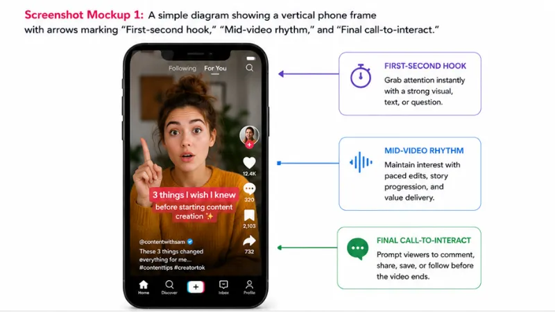
Crafting Positive Momentum on TikTok via Improved Interaction Habits

iGaming License: Meaning, Importance, and Its Role in the Global Online Gaming Industry
How to Find the Best Online Reputation Management Services When Everyone Claims to Be the Best

The Best Forex Trading Platforms for Beginners in 2026
Turning Complex Challenges into Clear Opportunities
Why Hiring Readiness Matters More Than Ever for Fast-Growing Startups