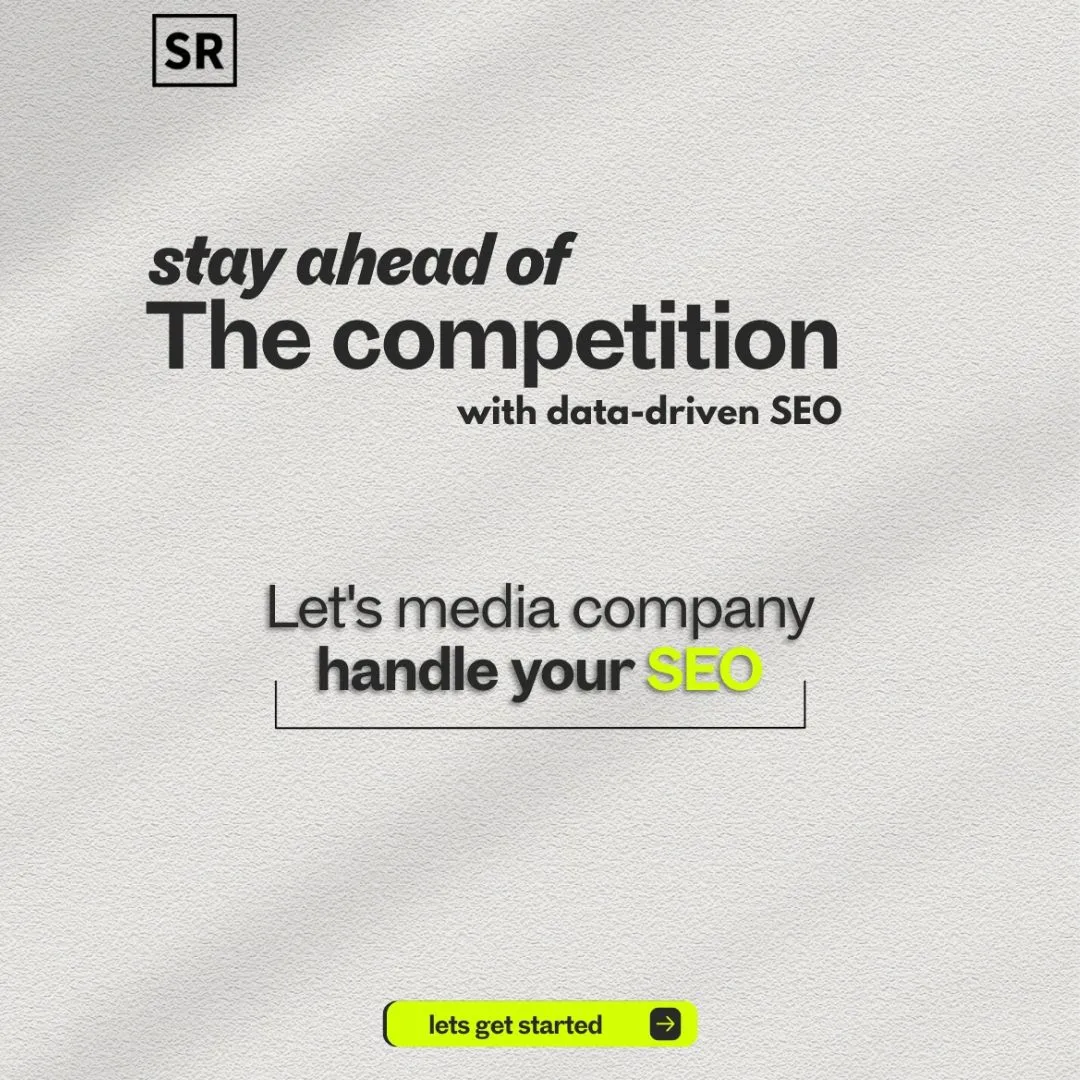
Web Design for Startups: 3 Key Things To Consider Before Launching Your Platform
Jan 14, 2026 | By Team SR

Your startup's website is way more than a digital business card. It's your main sales tool, your brand's first handshake, and often the first thing potential customers, investors, and partners see.
 Follow us
 Follow us
The difference between a website that sparks growth and one that fizzles out? It usually boils down to three core things: a clear brand identity, an intuitive user experience, and conversion-focused design.
Most founders dive into web design without a real plan. Some chase flashy trends, while others settle for bland templates that don't show off what makes them special.
Knowing what actually matters in startup web design helps you sidestep expensive mistakes and build something that lasts.
RECOMMENDED FOR YOU

Integrated Solar Panels That Don’t Sit On Top Of Your Roof Like An Afterthought
Team SR
Dec 17, 2025


This guide breaks down the must-haves before you launch your startup's site. We'll look at how to tie your design choices to your business goals, create an experience that actually clicks with your audience, and use strategies that turn visitors into customers.
The Unique Nature of Web Design for Startups
Web design for startups is a different beast compared to working with big, established companies. Startups have to juggle a bunch of goals at once, all while dealing with limited time and money.
Unlike traditional businesses, startups need to prove their business model as they build their online presence. Your design has to be flexible - you might need to pivot after getting feedback or learning something new about your audience.
You just can't spend months perfecting a site that might need a total overhaul in a few weeks.
Key characteristics that define startup web design:
- Resource constraints - Limited budget and small teams
- Speed requirements - Need to launch fast and test market fit
- High uncertainty - Product and messaging can change quickly
- Multiple audiences - Customers, investors, and potential hires all matter
Starting with mockups lets you test ideas before you burn through your dev budget. It's a smart way to save time and cash, and make sure your design actually lines up with your business goals.
Don't chase perfection from day one. Launch with something functional (and get outside assistance if needed) that explains your core value, then tweak things as you learn from real users. Honestly, this is how you avoid building stuff nobody wants.
The startup world calls for practical design - something that's attractive but also gets the job done. Your website isn't just a pretty face; it's a tool for growth. Every element should serve a purpose, whether that's collecting leads, showing off your product, or building trust.
Defining Goals and Understanding Your Target Audience
Before you even start designing, get clear on your goals and who you're building for. This groundwork shapes every decision down the road.
Figure out what your site needs to do. Is it for lead generation, direct sales, or just getting your name out there? Nail down specific, trackable goals that fit your business plan.
Key Steps for Audience Definition:
- Build detailed user personas that reflect your ideal customers
- Map the user journey from first visit to signup or purchase
- Look at user behavior trends in your industry
- Analyze competitors to spot what they're missing
Understanding your audience is more than just age or location. You need to know what bugs them, what they like, and how they use the web. This insight shapes everything - from navigation to content.
Your value proposition has to be obvious. Visitors should know why they should care about you within a few seconds.
Think about how different groups use websites. B2B buyers tend to want more details and take their time. B2C folks? They're quicker and often go with their gut.
Keep an eye on user engagement stats. Watch bounce rates, time on site, and conversions to see if you're actually connecting with your audience. If not, don't be afraid to switch things up based on what the data says.
1 Building a Strong Brand and Visual Identity
Your brand identity shapes how people see your startup and helps you stand out. Consistent visuals and smart design choices build recognition and trust.
Establishing Brand Consistency
Brand consistency means using the same visuals and voice everywhere - your site, social media, emails, you name it. Your logo, colors, fonts, and messaging need to match up.
Make a style guide. Spell out your logo rules, color codes, font choices, and any do's and don'ts. It helps everyone stay on the same page.
Inconsistent branding just confuses people. If your site looks different from your LinkedIn or pitch deck, it weakens your image. Stick with your core look and feel to build trust over time.
Creating a Compelling Value Proposition
Your value proposition is your pitch - why should anyone pick you? Make it clear, specific, and impossible to miss.
Put it front and center on your homepage. Use plain language that highlights what you actually deliver. "Save 5 hours a week on invoicing" beats "Streamline your workflow" any day.
Try out different versions with real users and see what works. Track which ones get more clicks or signups. And make sure it matches your brand - if you're calling yourself innovative, your site should look the part.
Crafting an Effective Visual Hierarchy
Visual hierarchy is about guiding visitors through your content in the right order. Size, color, and spacing help highlight what's most important.
Your main message should be the biggest thing on the page. Details can be smaller, but still easy to read. Use bold for emphasis and italics for subtle points.
White space is your friend. Don't cram everything together. Give key elements room to breathe so they stand out.
Make your call-to-action buttons pop with contrasting colors. They should be big enough to tap on mobile, and not buried in clutter.
Selecting the Right Color Palette and Typography
Colors set the mood and help people remember your brand. Pick 2-3 main colors that fit your vibe - blue for trust, orange for energy, you get the idea.
Stick to a tight palette. Too many colors just look messy. Use one main color, a secondary for accents, and neutrals for backgrounds and text.
Typography matters for both looks and readability. Two fonts are plenty - one for headings, one for body text. Sans-serifs like Helvetica or Inter are solid bets for screens.
Make sure there's enough contrast between text and background. Keep body text at least 16px so it's easy to read everywhere. Always test your choices on different devices to be safe.
2 User Experience and User Interface Best Practices
Good UX shapes how people use your site. A thoughtful UI makes sure they don't get lost or frustrated. Focus on simple navigation, easy reading, and visuals that actually help.
Ensuring Intuitive Navigation
Navigation should make sense instantly. Users should find what they need in three clicks or less.
Keep your main menu at the top with labels that match how your audience thinks. Sticky navigation helps too - especially on long pages - so users don't have to scroll back up.
Some navigation basics:
- Consistent placement: Menus should be in the same spot everywhere
- Visual hierarchy: Make main actions stand out
- Mobile optimization: Use hamburger menus or simpler layouts on phones
Test your user flows. If people can't find your contact page or pricing, it's time to tweak your nav.
Optimizing for Readability and Accessibility
Readability starts with the right fonts and sizes. Use at least 16px for body text and give lines enough space (1.5 to 1.8 line height feels about right).
Color contrast is huge for both readability and accessibility. Stick to WCAG 2.1 standards - 4.5:1 contrast for normal text, 3:1 for big text. That way, everyone can read your stuff.
Make your content scannable:
- Keep paragraphs short (2-4 sentences)
- Add subheadings every couple hundred words
- Use bullet points for lists
- Leave enough white space between sections
Add alt text to images and make sure your site works with just a keyboard. These moves help more people use your site and just make the whole experience better.
Strategic Use of Images and Videos
High-quality images show you're legit. But keep file sizes under 200KB so your site doesn't crawl.
Use images that actually add value - product shots, team photos, diagrams. Skip the cheesy stock photos if you can.
Videos can boost engagement, but be careful. Host them on YouTube or Vimeo to save bandwidth, and always use a thumbnail that loads fast. If you autoplay, keep it muted and in the background.
Some visual content tips:
Element Best Practice Why It Matters File format WebP or optimized JPG Faster loading times Dimensions Match display size Prevents unnecessary data usage Lazy loading Enable for below-fold content Improves initial page speed
Don't overdo it with images and videos. Only use what actually helps your users.
3. Conversion Optimization Essentials
Conversion optimization is what turns your website into something that actually brings in business. The big three: clear CTAs, ongoing testing, and ways to keep people engaged.
Designing Clear and Compelling CTAs
Your calls to action are the bridge between interest and action. Each one should spell out exactly what happens next - "Start Your Free Trial" beats "Submit" by a mile.
Effective CTA Design Elements:
- Contrasting colors so buttons stand out
- Whitespace around CTAs to draw the eye
- Specific copy to remove doubt
- Strategic placement - put them where people are ready to act
CTA size and position really matter. Put your main CTAs where people naturally look after reading something important, like after your value prop or a feature list.
Try different versions - colors, wording, placement - and see what gets the most clicks. Sometimes, a tiny tweak can bump conversions by 20-30%.
A/B Testing for Continuous Improvement
A/B testing takes the guesswork out of optimization. You compare two versions of a page element to see which one actually works better.
Start with the big stuff - think headlines, CTAs, or how long your forms are. Skip the tiny tweaks like font choices, at least at first.
Let your tests run for at least a week or two. That gives you data from different days and traffic patterns.
Your sample size matters. You’ll usually need several hundred conversions per variation to spot any real difference in conversion rates.
Keep a record of your test results somewhere everyone can find them. Even when a test flops, you learn what just doesn’t click with your audience - and that’s honestly just as valuable as a win.
Reducing Bounce Rate and Enhancing Engagement
Bounce rate tells you how many visitors leave without doing anything on your site. If it’s high, something’s off - maybe your content isn’t what people expected, or maybe there are annoying technical issues driving them away.
Page load speed plays a huge role here. Every extra second it takes to load, you lose more people. Compress your images, trim the code, and lean on content delivery networks if you can. Try to keep things under three seconds - any longer and, well, folks just don’t wait around.
Give your content a clear visual hierarchy so people know where to look first. Headings help, and so do bullet points. Break up big paragraphs; nobody wants to squint through a wall of text.
Internal links are underrated. After you explain a feature, why not nudge readers to a case study or a demo? If you mention pricing, maybe link over to a comparison or some customer testimonials. It keeps folks moving through your site instead of bouncing out.
Engagement Tactics:
- Try adding interactive stuff - calculators, product configurators, whatever fits.
- Videos work wonders, especially for explaining tricky concepts fast.
- Give away something useful, like downloads or a newsletter sign-up.
- Show off some social proof right where it matters most - near your conversion buttons.
Navigation should be painless. Don’t overload your top menu; five or six categories max is plenty. Your most important pages should be no more than two clicks from the homepage. If people can’t find what they need quickly, they’ll just leave.
Recommended Stories for You

Team SR Jan 22, 2026

Team SR Feb 24, 2026

Team SR Oct 21, 2025

Team SR Mar 19, 2026

Team SR Dec 12, 2025
Trending Stories

Understanding biometric security and Nedap Security Management

Career Change After 40: Proven Strategies for Professionals Seeking Meaningful Work

From Agency to Independent Studio: Building a Creative Practice With Intention

From Classroom to C-Suite: How Student Entrepreneurs Can Turn Academic Projects into Startup Success Stories

Mistakes to Avoid When You Rent a Convertible Car in Dubai for a Short Trip

CoinKnow Review 2026: Is This the Best Coin Identifier App for US Coin Beginners?
Finsea24 Review: Tips to Navigate Through Forex Market Volatility [finsea24.com]
Best Instagram Video Downloaders in 2026