Every time you hand someone your business card, it’s like you’re handing them a small piece of your brand. You want that piece to shine. But too many people mess up little details and end up looking less professional than they meant to. Whether you’re just starting out or trying to redesign your card, avoid these errors so your card leaves a good mark.
 Follow us
 Follow us
In this article I’ll walk you through 5 big mistakes to watch out for when creating your business card design. Use them as your checklist so your next card feels polished, useful, and memorable.
Mistake #1: Too Much or Too Little Information
It sounds obvious, but many business cards fail because they cram in everything, or on the other hand, barely tell anything.
- Too much information: Listing every service, every phone number, every social profile can make your card look overwhelming. The reader gets lost.
- Too little information: If your card doesn’t tell people how to contact you, what you do, or who you are, it’s useless.
What to include: Your name, title, phone number, email, website (or main social media), and possibly a one-line tagline or slogan that sums up what you offer. Stick to essentials.
RECOMMENDED FOR YOU


Mistake #2: Poor Readability
Even with great info, if people can’t read it easily, what’s the point? Readability depends on font, contrast, size, and layout.
- Tiny fonts: Fonts that are too small are a common issue. If someone needs to squint or has bad lighting, they might give up.
- Bad contrast: Light text on light background, or dark text on dark, poor combo.
- Fancy but unreadable fonts: Swirly script or overly stylized typeface might look artistic, but if it slows reading, it’s hurting more than helping.
Test your design at actual size. Hold it in your hand. Show it to someone else. If they struggle, adjust!
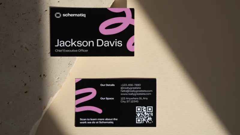
Mistake #3: Low-Quality Images or Materials
The feel and look of the card speak volumes. Low-quality images and flimsy paper make you seem unpolished, even if you’re amazing at what you do.
- Pixelated logos or images: Always use high-resolution artwork suitable for print. If your logo gets blurry, it drags the whole perception down.
- Cheap paper stock: Thin, weak card stocks can bend, crease, or even tear. A heavier, more durable paper gives weight to your brand, literally.
- Poor finishes or cuts: Rough edges, faded print, color bleed, that stuff hurts. If the print shop isn’t careful, your design can be ruined in production.
Mistake #4: Ignoring the Back and the Overall Layout / Bleed
Many designers ignore the back of the card or don’t plan layout constraints correctly. Also, forgetting bleed, cut lines, and safety zones is a sneaky mistake.
- Don’t waste the back: The back is extra space, use it for something useful (QR code, little illustration, slogan) rather than leaving it blank (unless blank fits your design).
- Bleed and cut lines: If your design goes to the edge of the card, make sure there’s extra margin (bleed) so when they cut it, nothing important is chopped off. Avoid designs whose key elements are too close to the edges.
- Alignment and layout consistency: Keep things lined up, consistent margins, even spacing, balanced composition. A card that looks “tilted” or sloppy makes you seem careless.
Mistake #5: Inconsistent Branding & Unprofessional Details
Your business card should feel like part of your bigger brand story. If it feels disconnected, people get confused about who you are.
- Brand mismatch: If the fonts, logo, colors, or style differ a lot from your business’s website, social media or other items (document headers, flyers), that’s a red flag. It weakens recognition.
- Using free email addresses: Sometimes people put Gmail, Hotmail, etc., on their business cards. It works, but using an email address that matches your domain looks much more professional.
- Typos and errors: This may be the most fixable but most neglected. A single grammatical error, wrong phone number, or misspelled name can spoil trust. Always proofread. Have someone else check.
Conclusion
Designing a business card isn’t just a small chore, it’s a chance to show you care, to impress, and to make connections. By avoiding the five mistakes above, you give yourself a much better shot of handing out something that people keep, notice, and associate with professionalism.
If you’re ready to try again, or want tools that make this easier, check out some great online resources like Adobe Express to help with layout, colours, and templates. Put time into your card design, your first impression (and maybe even your future client) might depend on it.
Recommended Stories for You

Team SR Dec 12, 2025

Team SR Apr 25, 2025

Team SR Jan 24, 2026

Team SR Nov 21, 2025
Team SR Feb 11, 2026

Team SR Dec 6, 2025
Trending Stories

Scaling Small Businesses Into Global Brands With the Latest Tech Trends

The Post-Purchase Gap: Where Startups Are Rebuilding E-Commerce Trust

What is intellectual property, and how is it protected in the UK
What UK Firms Should Outsource (and What to Keep In-House)

Gravesend Property Market: Stable Prices and Strong Demand for Terraced Homes

Dmitriy Makarov and the Secrets of Expanding Business Across Borders

Top 5 Access Control Systems for European Startups in 2025

Transforming agriculture with agritech innovation through start-ups